Overview
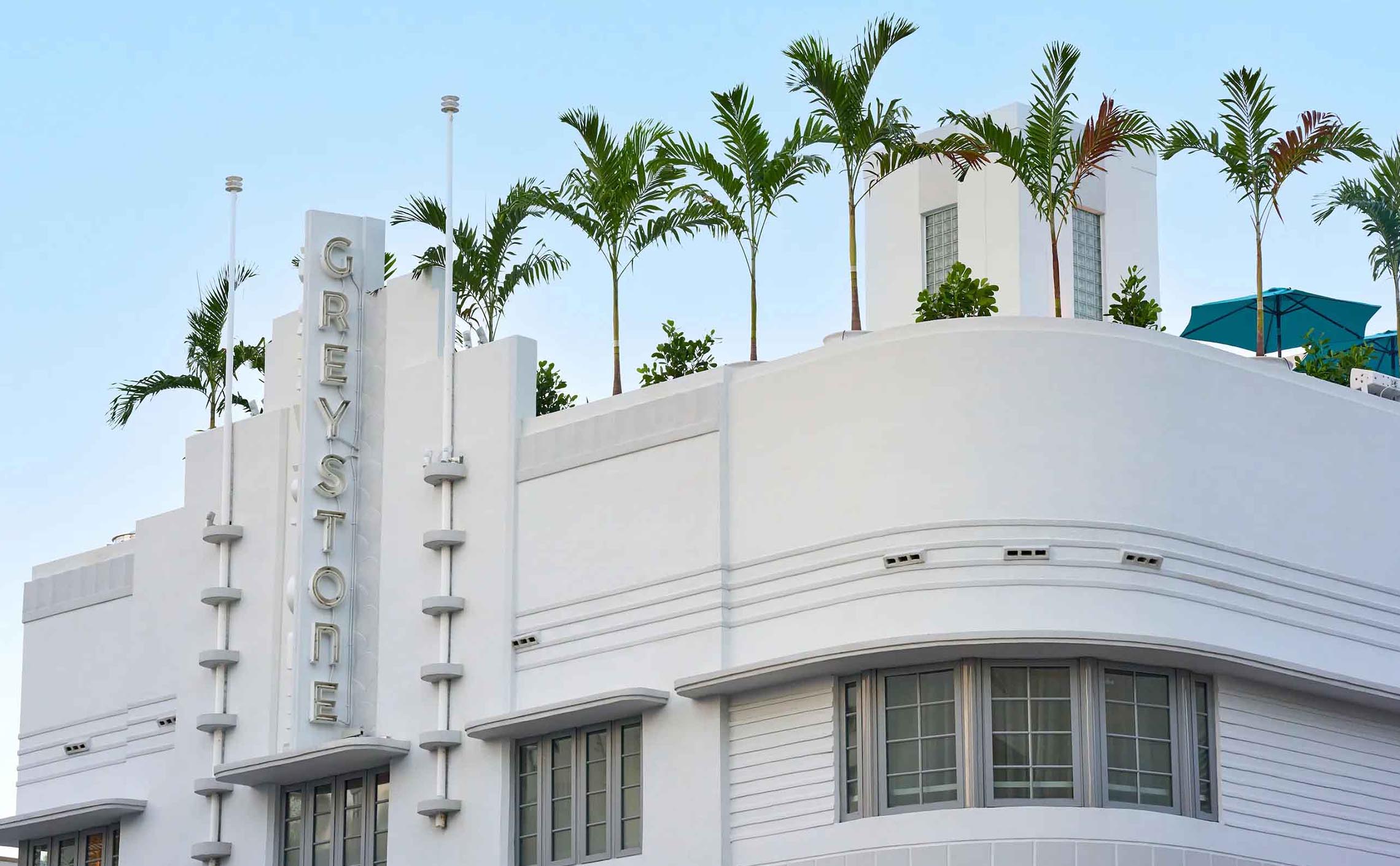
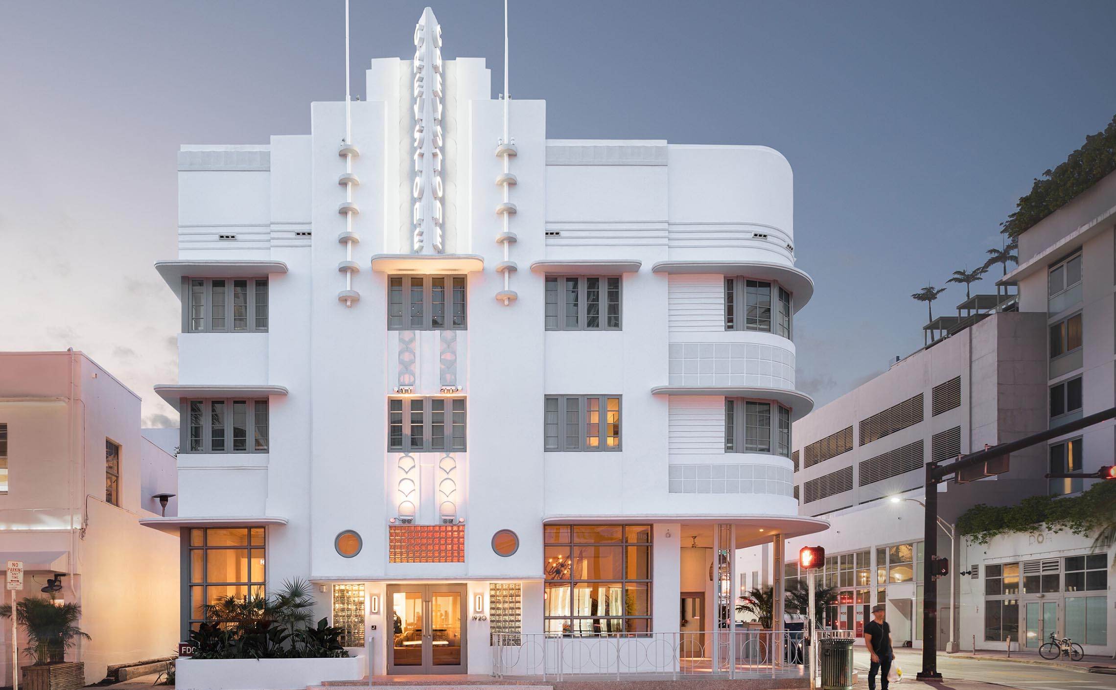
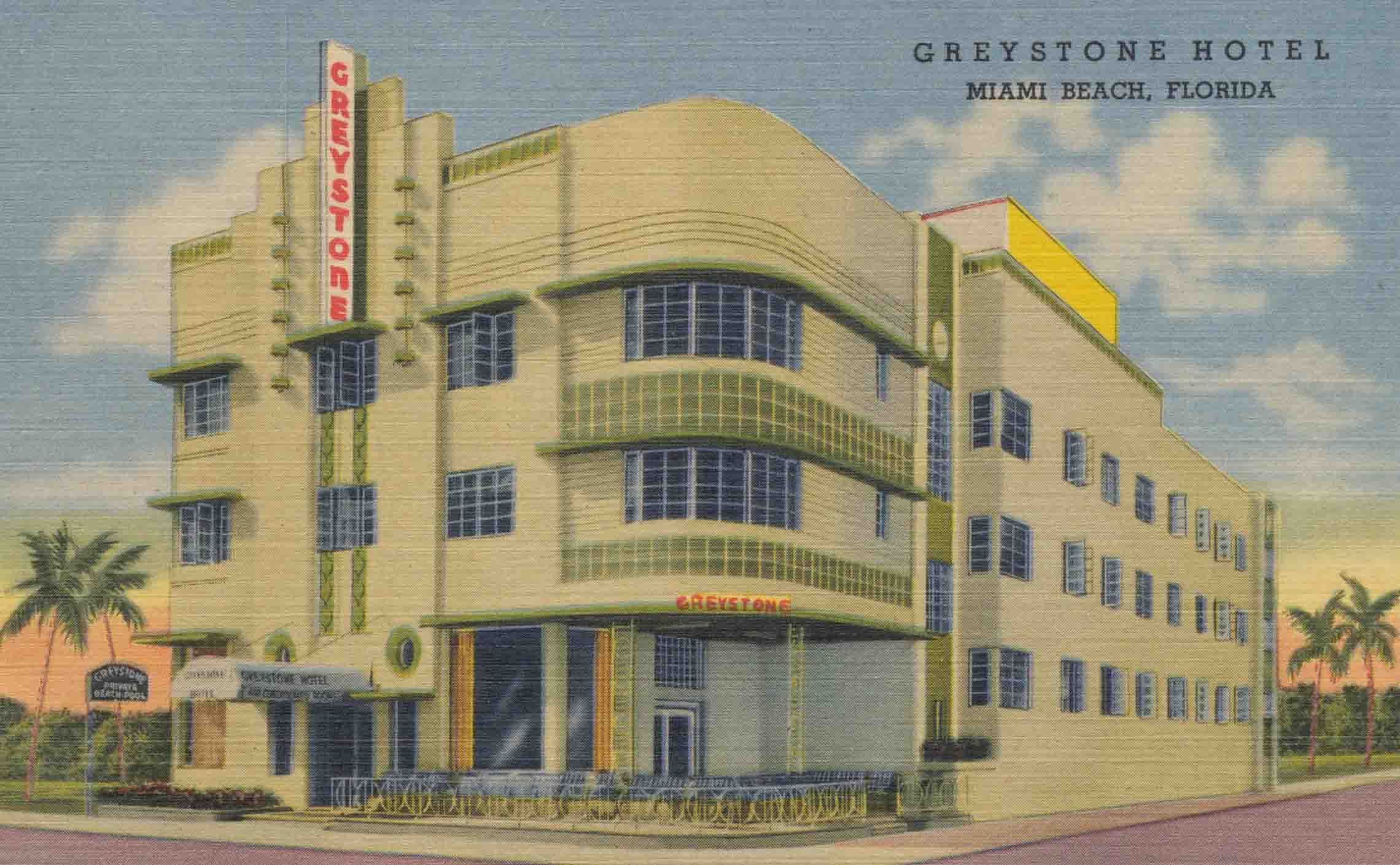
Hotel Greystone - Miami Beach
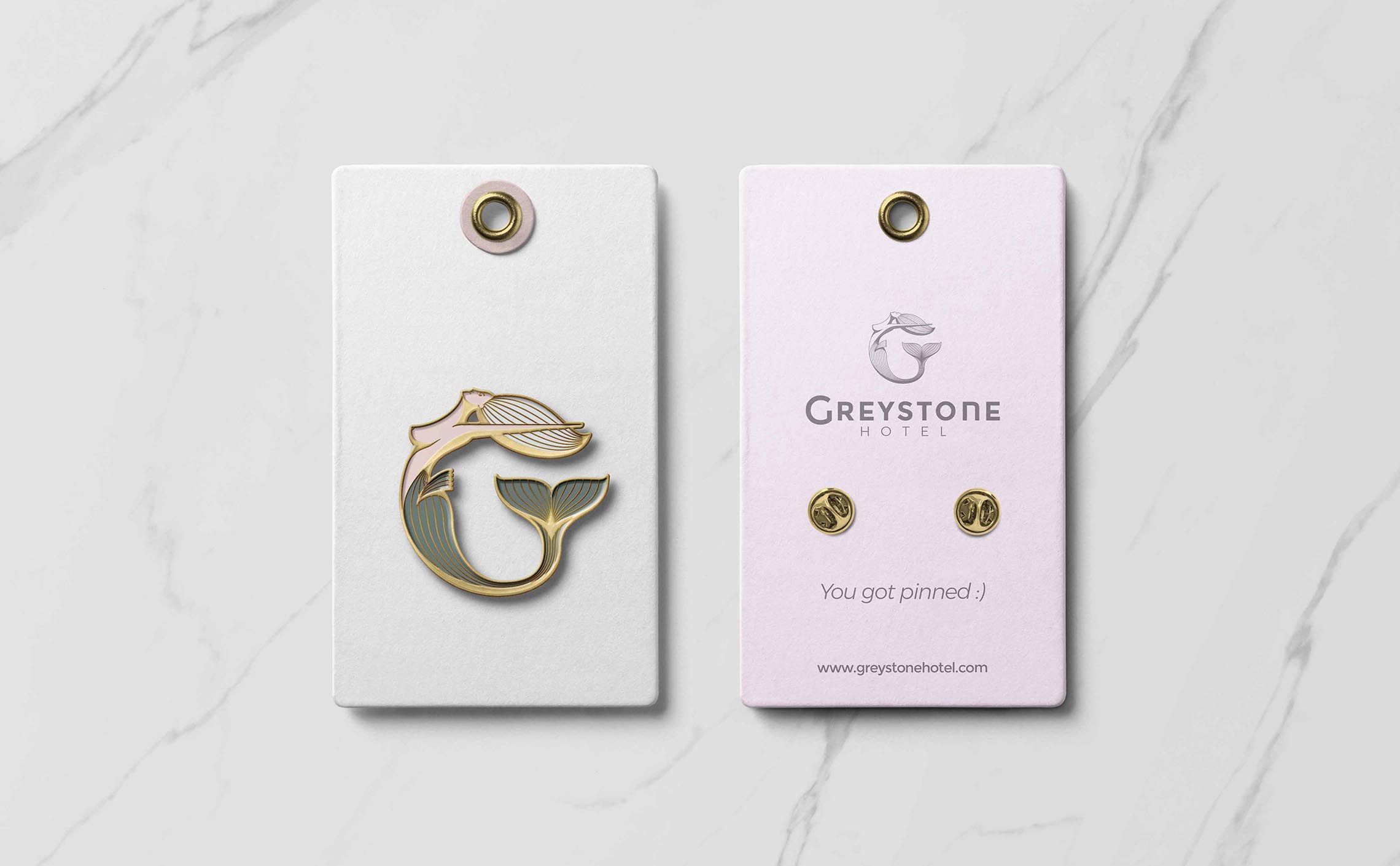
Logotype design & visual identity
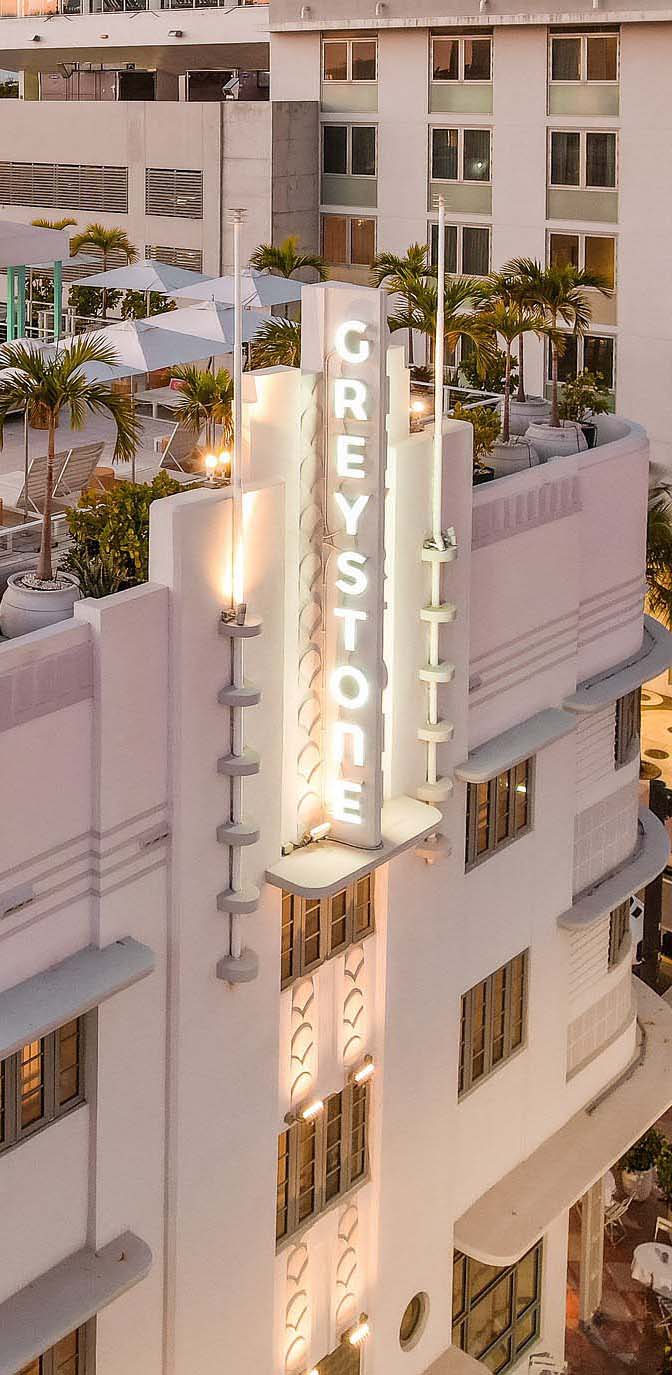
As per its Wikipedia page: the Hotel Greystone in Miami Beach, Florida, is an Art Deco-style hotel built in 1939.
In 2022 Architectural Digest termed the hotel an "architectural gem", "one of architect Henry Hohauser's iconic hotels", and one of "eight iconic buildings throughout the city that have been renovated to showcase their historic value through a 21st-century lens."
I was tasked with creating a bold identity for the renovated hotel, bridging the old and the new, in tune with the vibrant atmosphere of South Beach and Collins Avenue.

Client's Recommendations
&
Key Influences
The quintessential diamond studed flip flop
As expected with a renovation project of this scale, preparations spanned across years. I had plenty of pitch decks, interior design proposals, etc, to base my preliminary research on.
In a nutshell, my clients wanted sophisticated simplicity, controlled decontraction, and in their own words:
"the quintessential diamond studed flip flop".
Also, a few specific recommandations, especially regarding the style:
- Youthful, Charming, Stylish, Fun
- Whimsical, a Kind of Magic
- Flowing, Smooth, Effortless
- Legacy with a Twist, Remixed and Upgraded
- Trendsetter, Daring, Bold Design
- Human, Approachable (No Desk at Entrance, Casual Uniforms)
- Icon + Logotype
- Icon Possibly in Illustrative Style
- Steer Away Slightly from Straight Art Deco Aesthetic (Preserving Vertical Neon Sign on Building)
- Collins Ave: Beach, Arts, Conventions, Nightlife
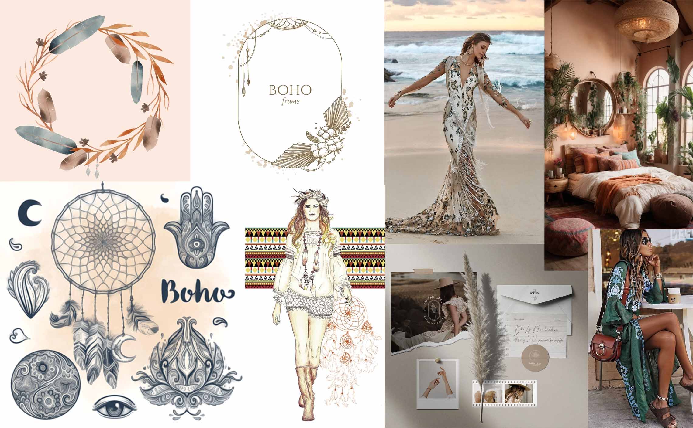
Boho Chic, Movement and Femininity
Throughout all my client's documents, there was an overall and persistent feeling of "movement".
Be it the ebb and flow of the waves on South Beach, the citrus scents floating in the air, Collins Avenue and its nightlife, the in-and-outs from the buidling that never really sleeps, even the women's uniforms: a chic, effortless and flowing white safari linen shirtdress.

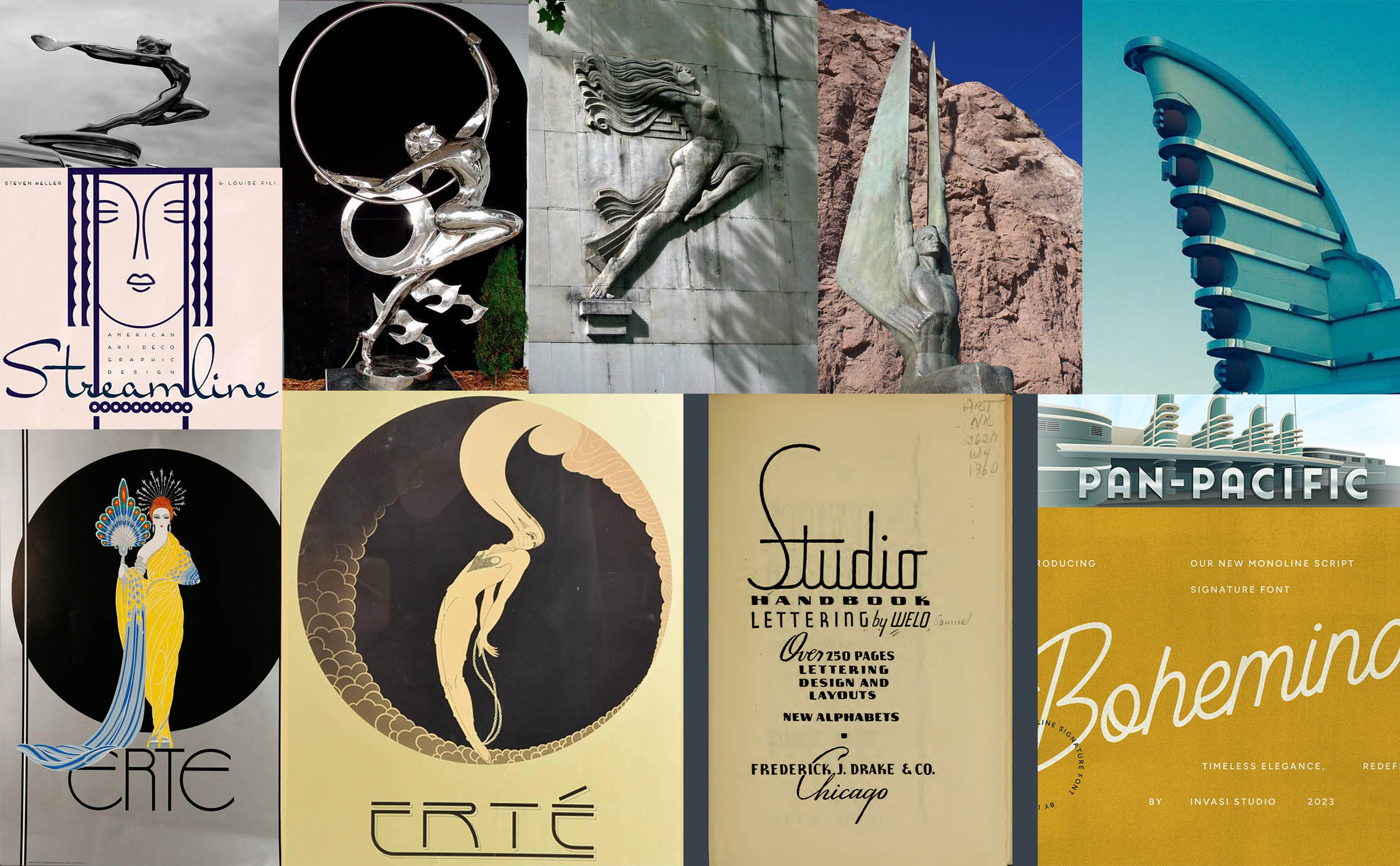
Inspirations
Art Deco & Boho Chic
Seeking bridges between bohemian chic and art deco, concepts such as movement, wind, wings, feathers, exaltation, and freedom are juxtaposed with art deco elements, including streamline design principles evident in the Greystone and its neon sign typography.
The loose yet geometric style of Erté, the renowned Vogue cover illustrator, serves as a potential bridge between these two aesthetic realms.
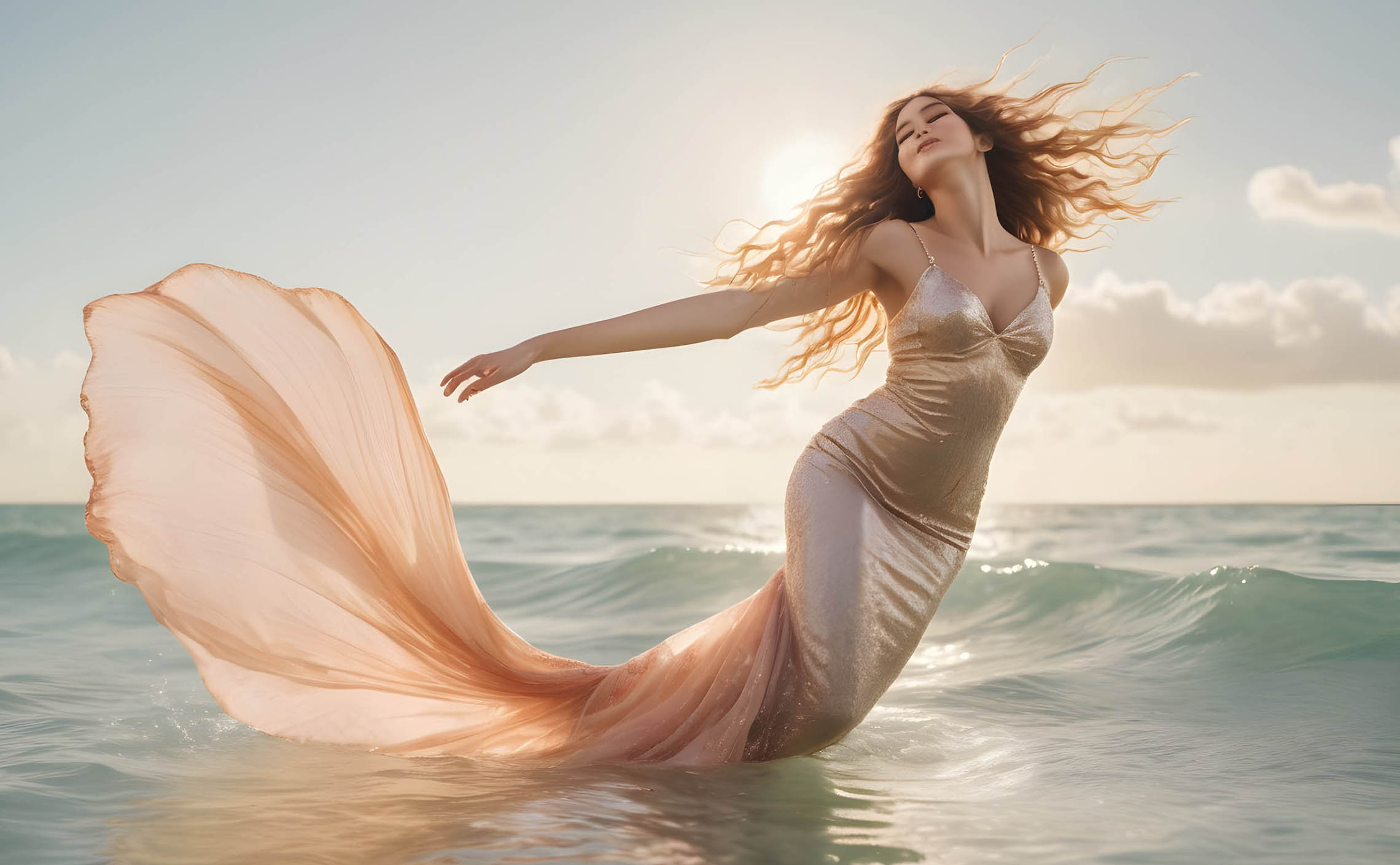
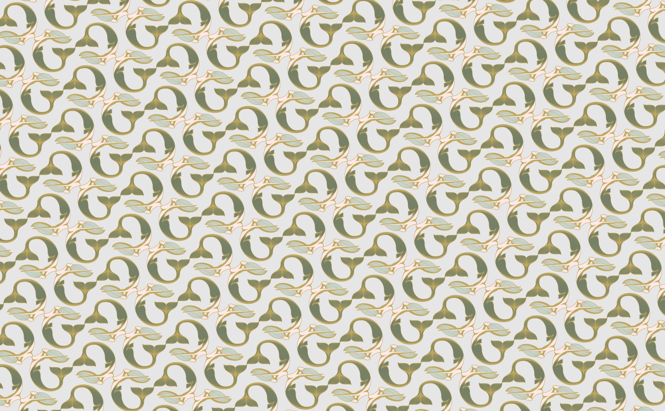
The Mermaid
Central to the boho style is the celebration of pure human freedom, expressed through comfortable and unrestrictive attire, embodying the joy of connecting with natural elements like sand underfoot.
This primal connection extends to a quasi-deistic reverence for elemental forces — wind, sun, water, fire, and earth — an organic mythology.
Pushing this line of thought, the concept of the mermaid seemed like the ideal junction between Art Deco exaltation, boho sensual freedom, and whimsical sophistication.
Also as a visual metaphor and beyond aesthetics, a mermaid, akin to a siren, possesses the allure to charm and draw people towards it. Which is very fitting for an hotel and a hub of activities.
In its topless portrayal, the mermaid finally subtly nods to the freedom and light nakedness synonymous with the bohemian spirit. This cheeky and daring posture communicates a bold, tasteful, and stylish statement; asserting that the Greystone embraces audacity with finesse and respect for the design era.
A mythological creature, in an updated Art Deco style. Timelessness in movement.
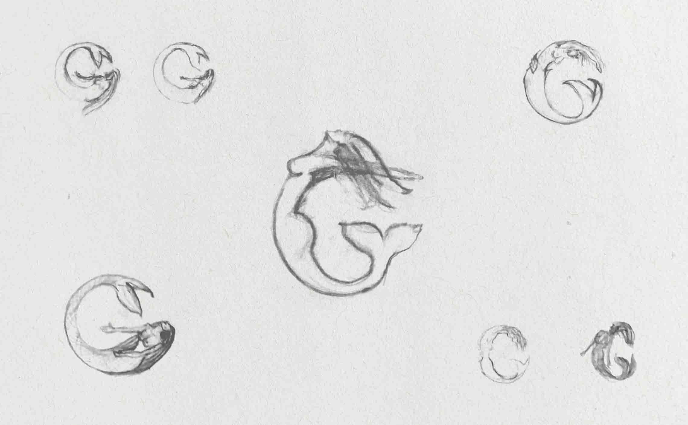
Sketches
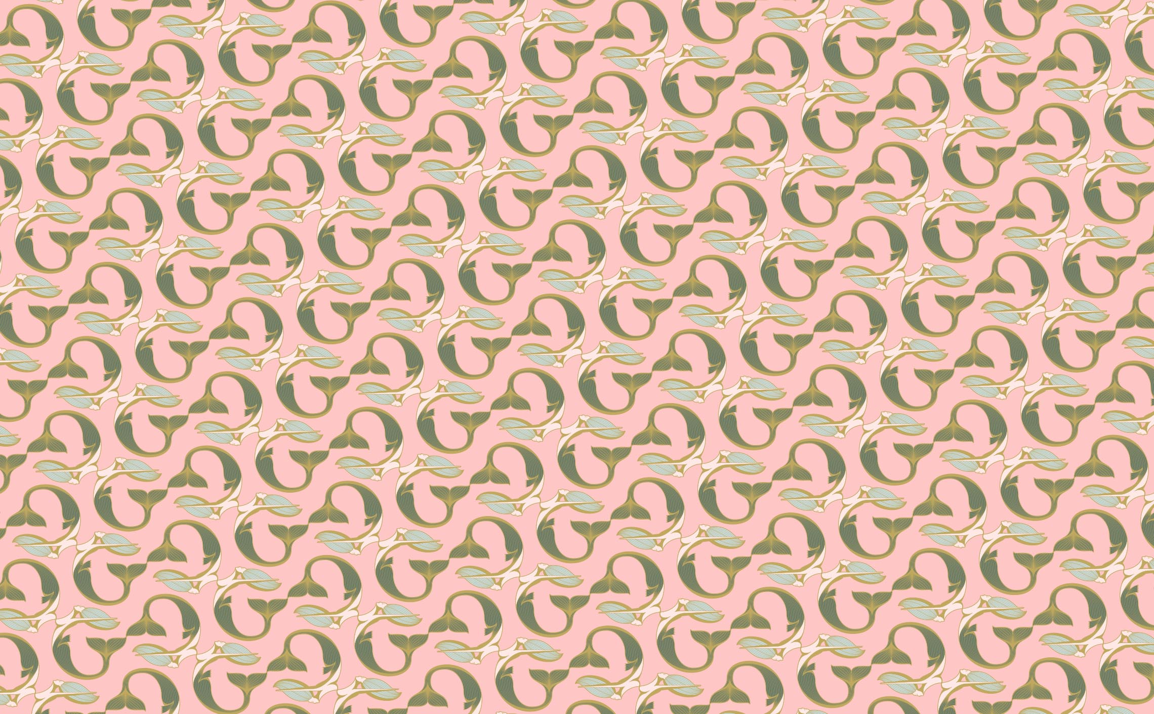
Modularity
A hotel requires the flexibility to apply its branding across a wide array of materials and objects.
The logotype is designed with versatility in mind.
Its modular structure through various lockups allows seamless adaptation across diverse mediums.
With an adjustable level of detail, the logo maintains visual integrity, ensuring a consistent brand presence across all applications.
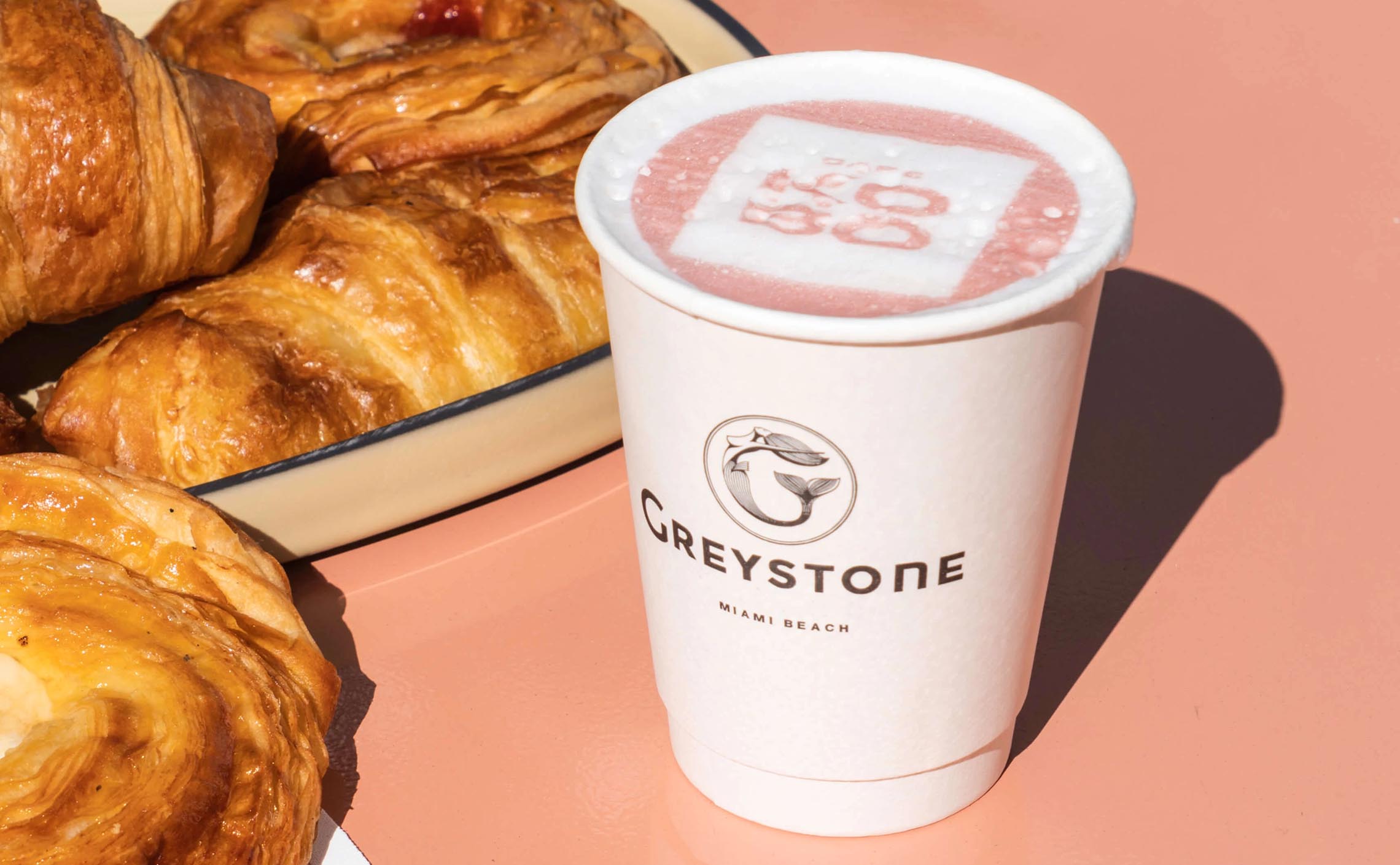
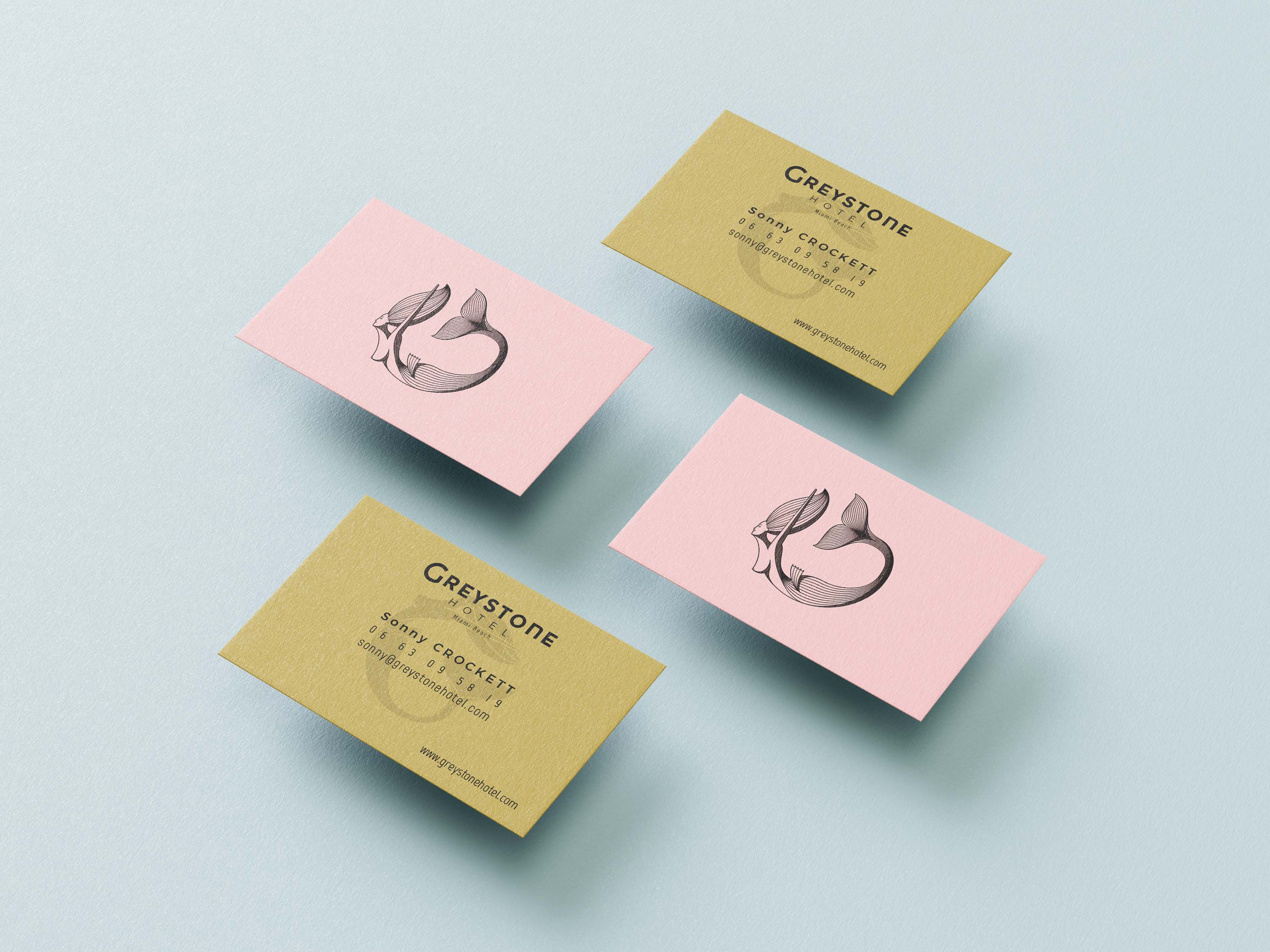
Color Scheme Hierarchy
For the color scheme, we drew inspiration from the "Miami vibe", infusing it with a refined touch.
Mutating the typical flashy neon lights into a palette of soft pastel hues, we evoke the city's energetic ambiance while maintaining an understated elegance.
Notably, the choice of pink hues, reminiscent of flesh tones, subtly echoes the imagery of the mermaid in our logo, forging a cohesive visual narrative.
Additionally, the overall palette exudes a subtle feminine undertone, harmonizing with the bohemian chic aesthetic to encapsulate the hotel's distinctive character with sophistication and allure.

Typograhy
Primary Font: Montserrat
We opted for Montserrat as the primary font due to its versatility and historical resonance.
This mainstream font was chosen for its striking similarity to the typeface used in the neon sign on the facade of the Greystone Hotel, particularly in the letter 'G.'
Additionally, Montserrat's inspiration from early 20th-century typography, as seen in the historic Montserrat neighborhood of Buenos Aires, aligns seamlessly with the hotel's architectural heritage.
Secondary Font: Marvel
Complementing Montserrat, we selected Marvel as the secondary font for its slender and elegant sans-serif design. Highly legible and suitable for small texts and body copy, Marvel adds a touch of refinement to the typographic hierarchy, ensuring clarity and visual harmony across all brand communications.

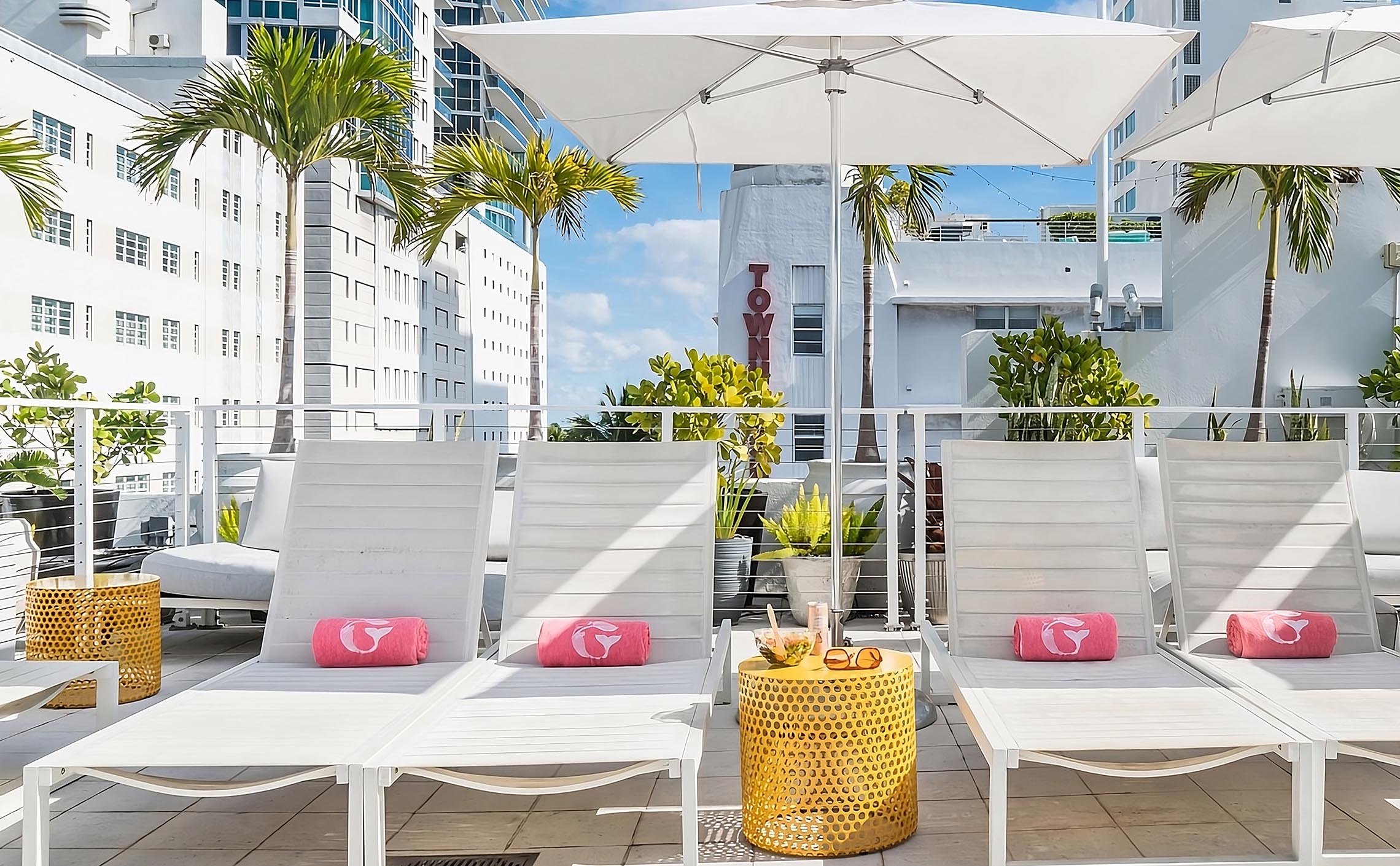
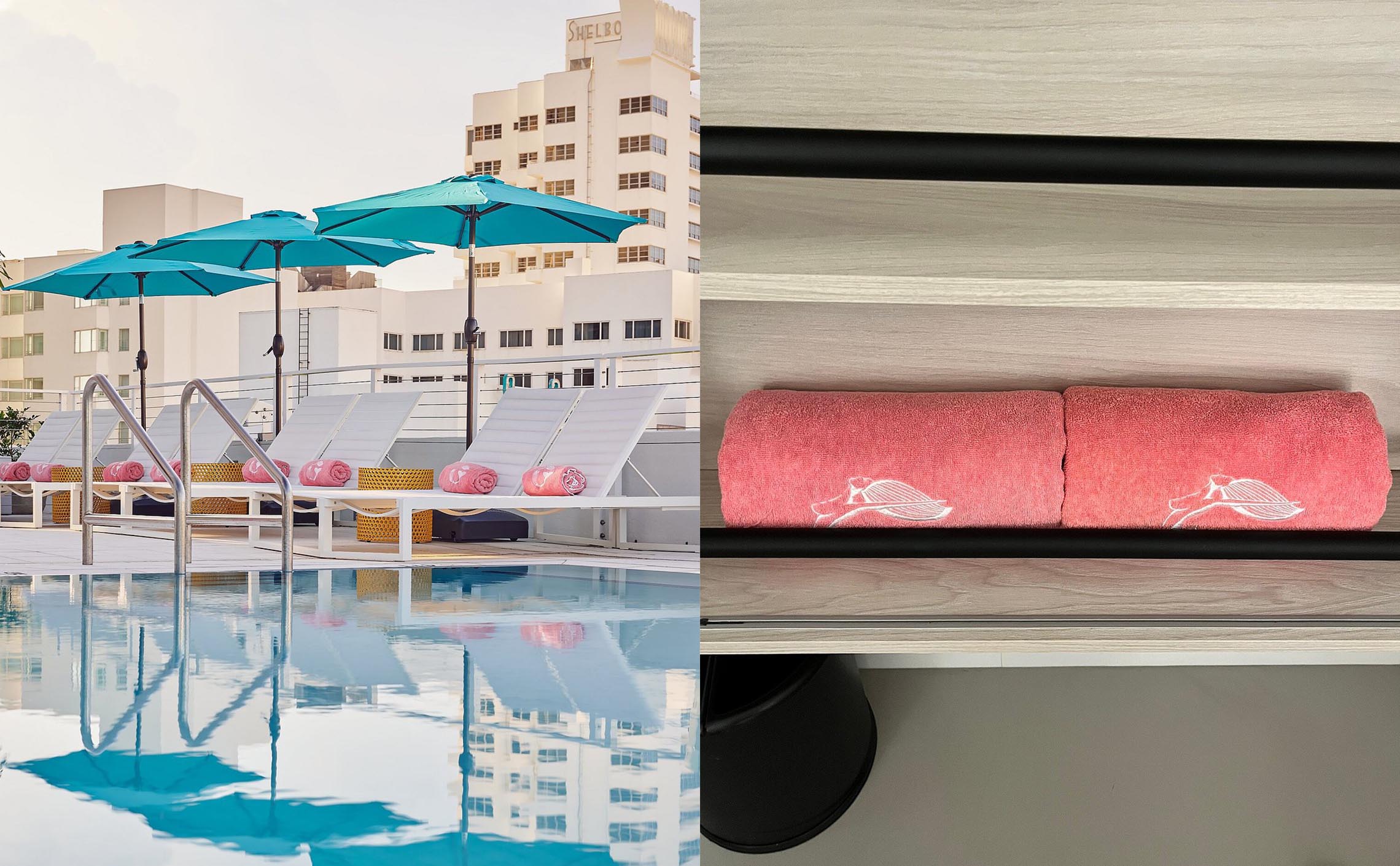
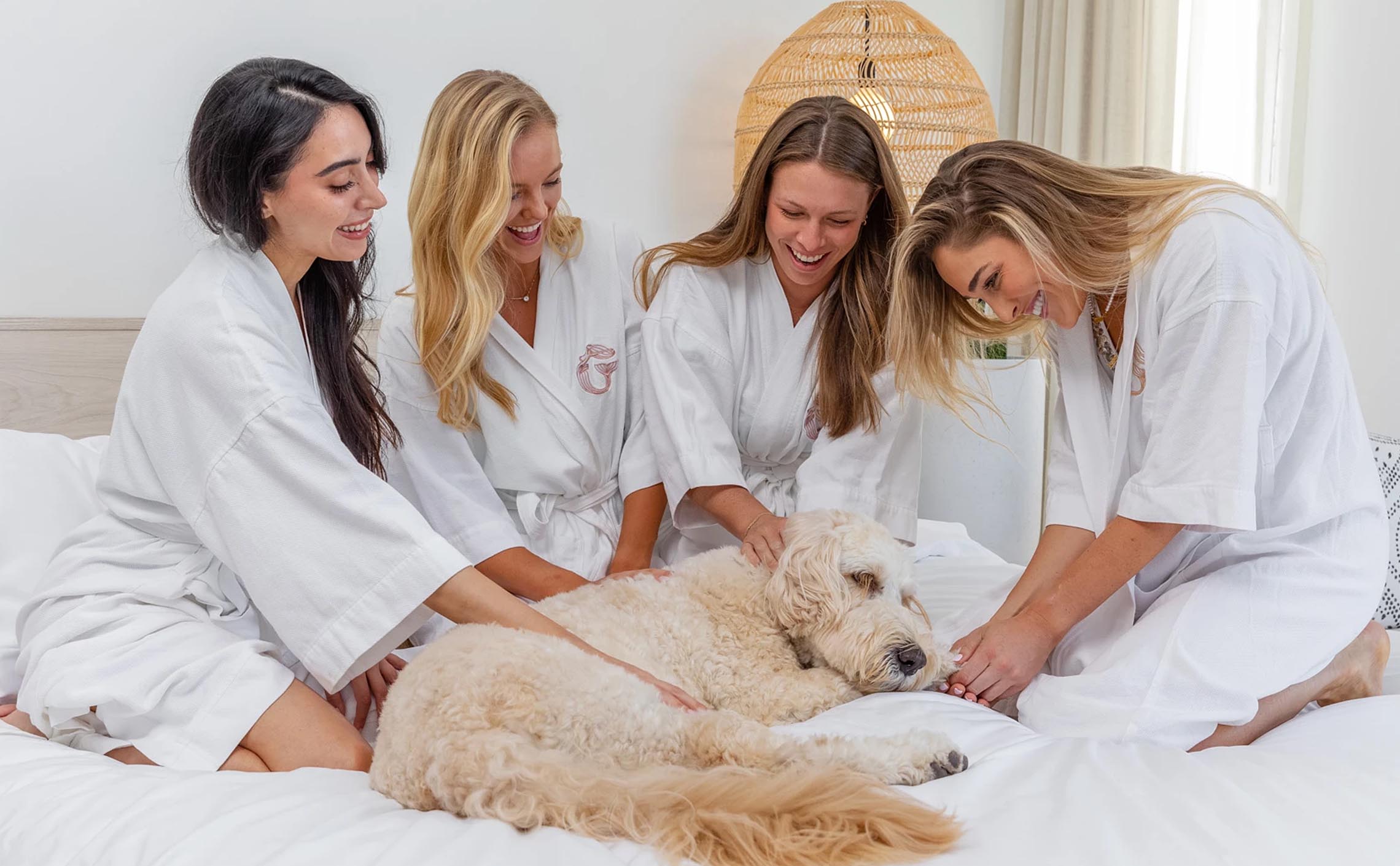
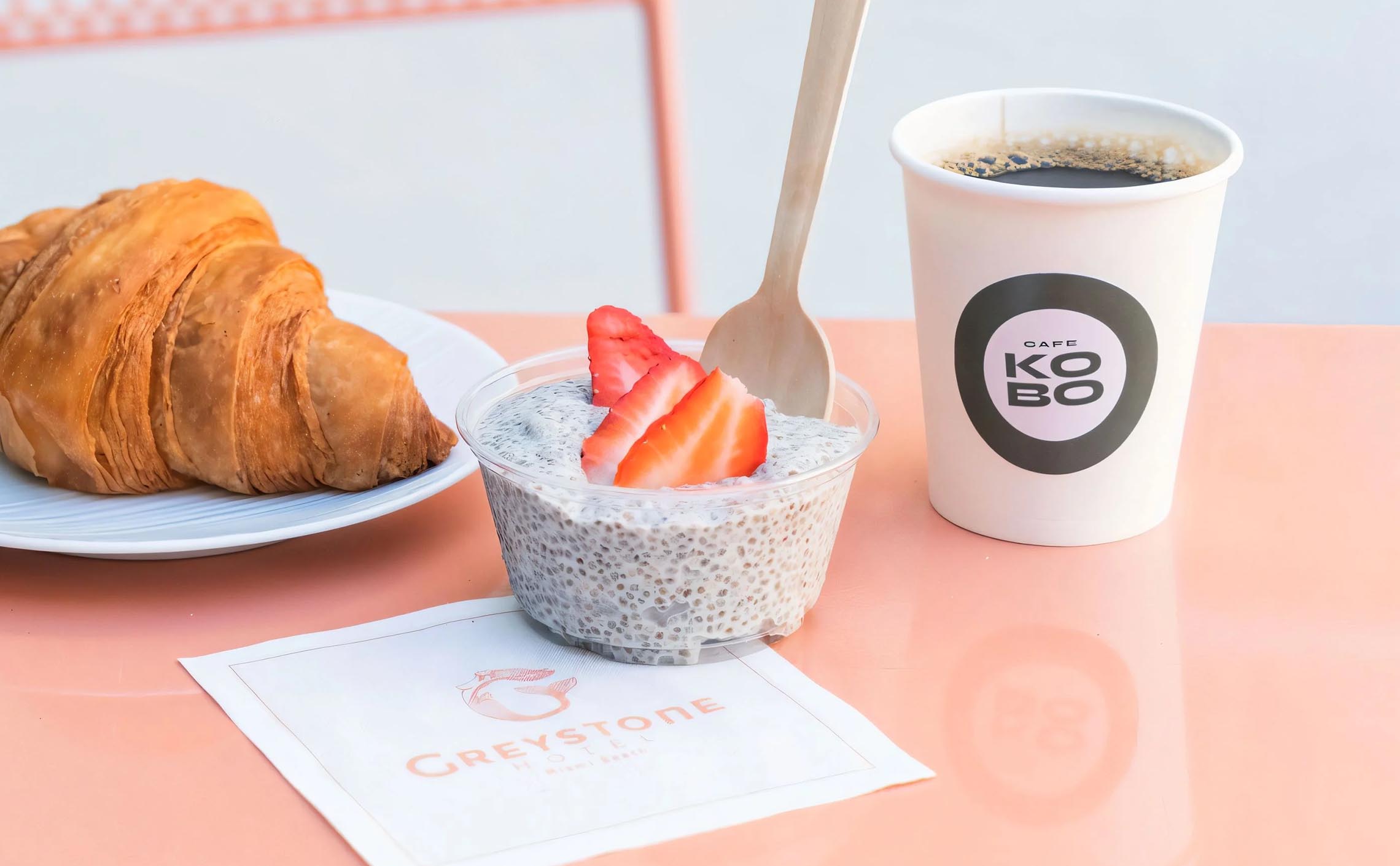
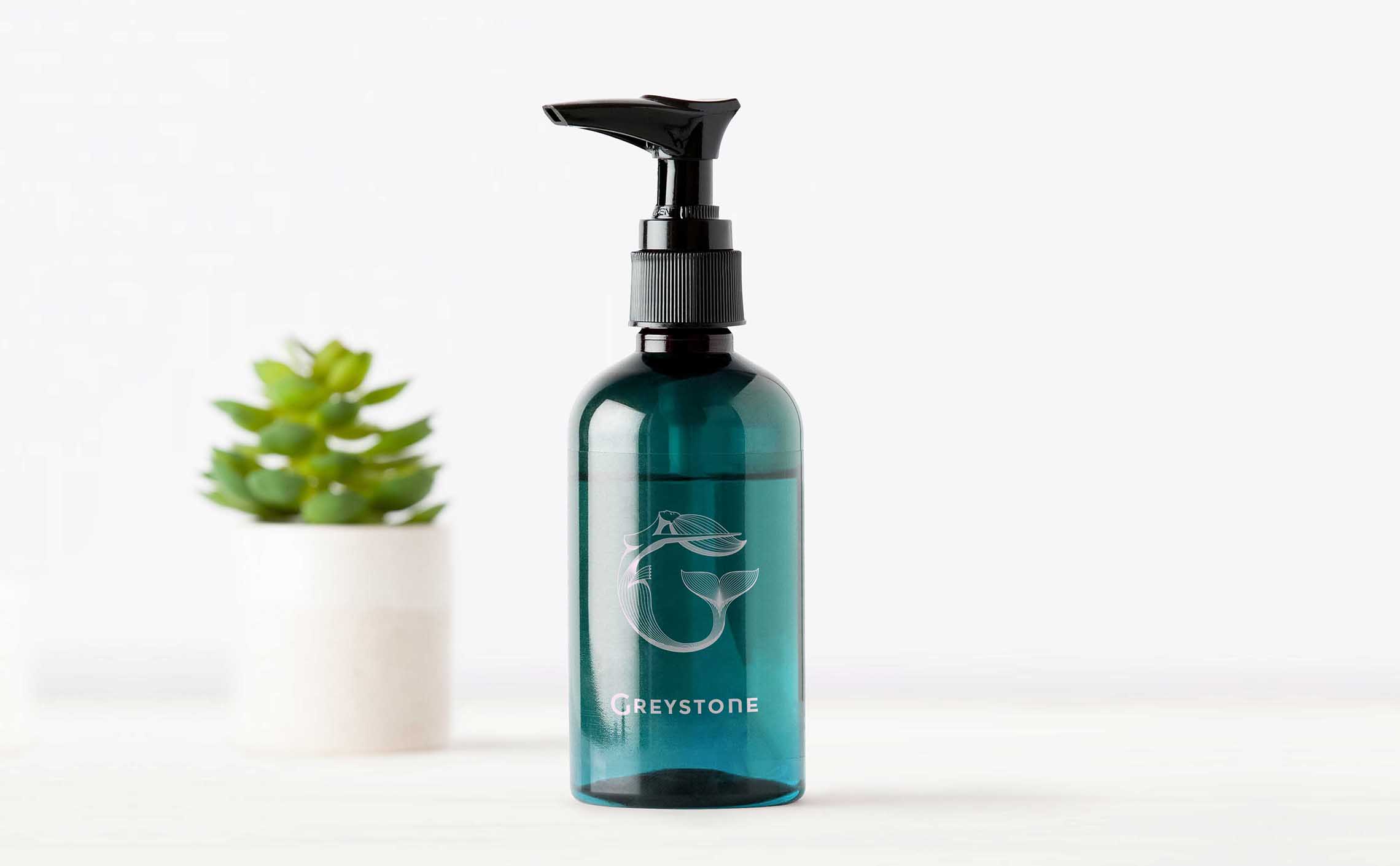
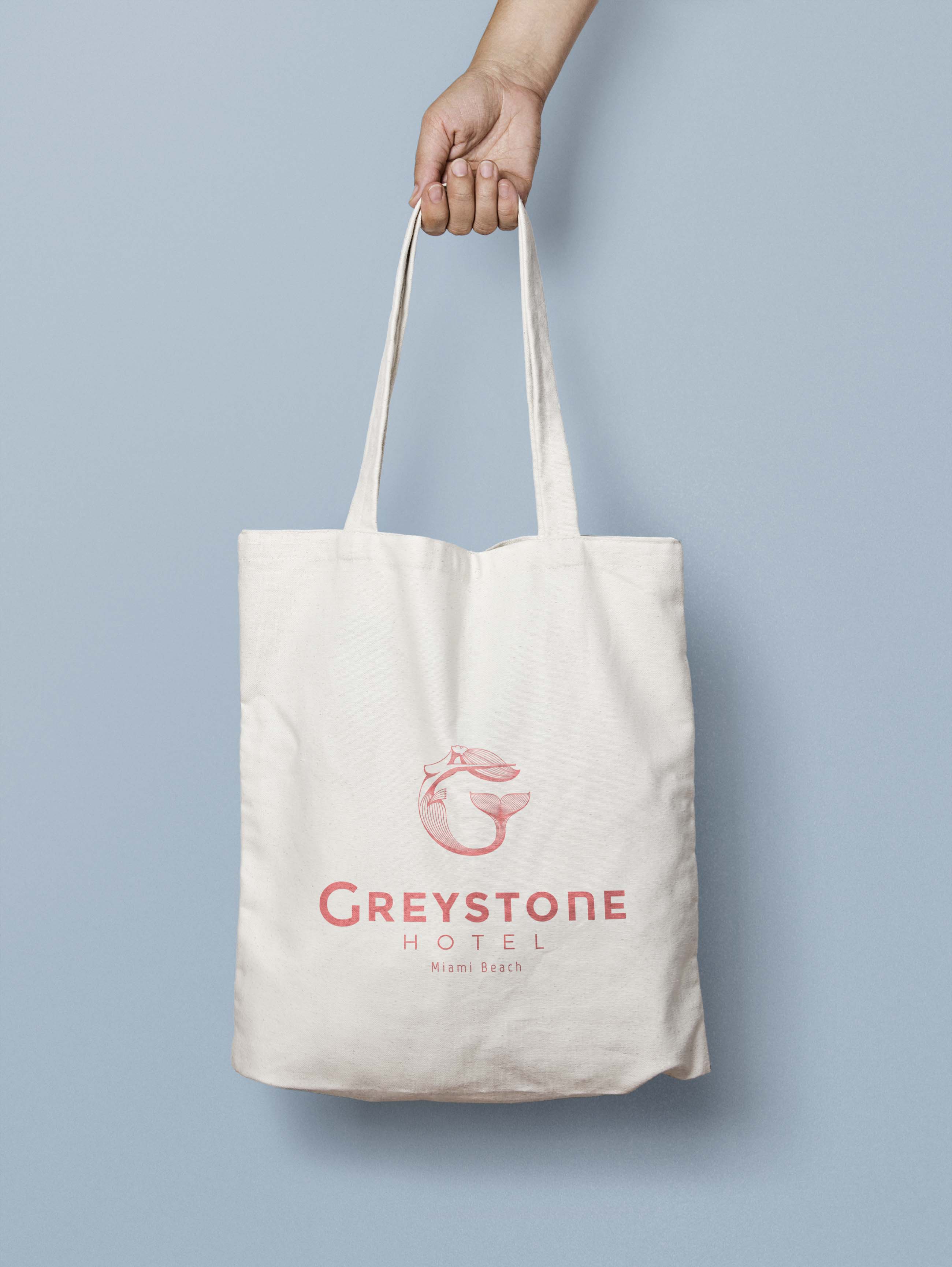
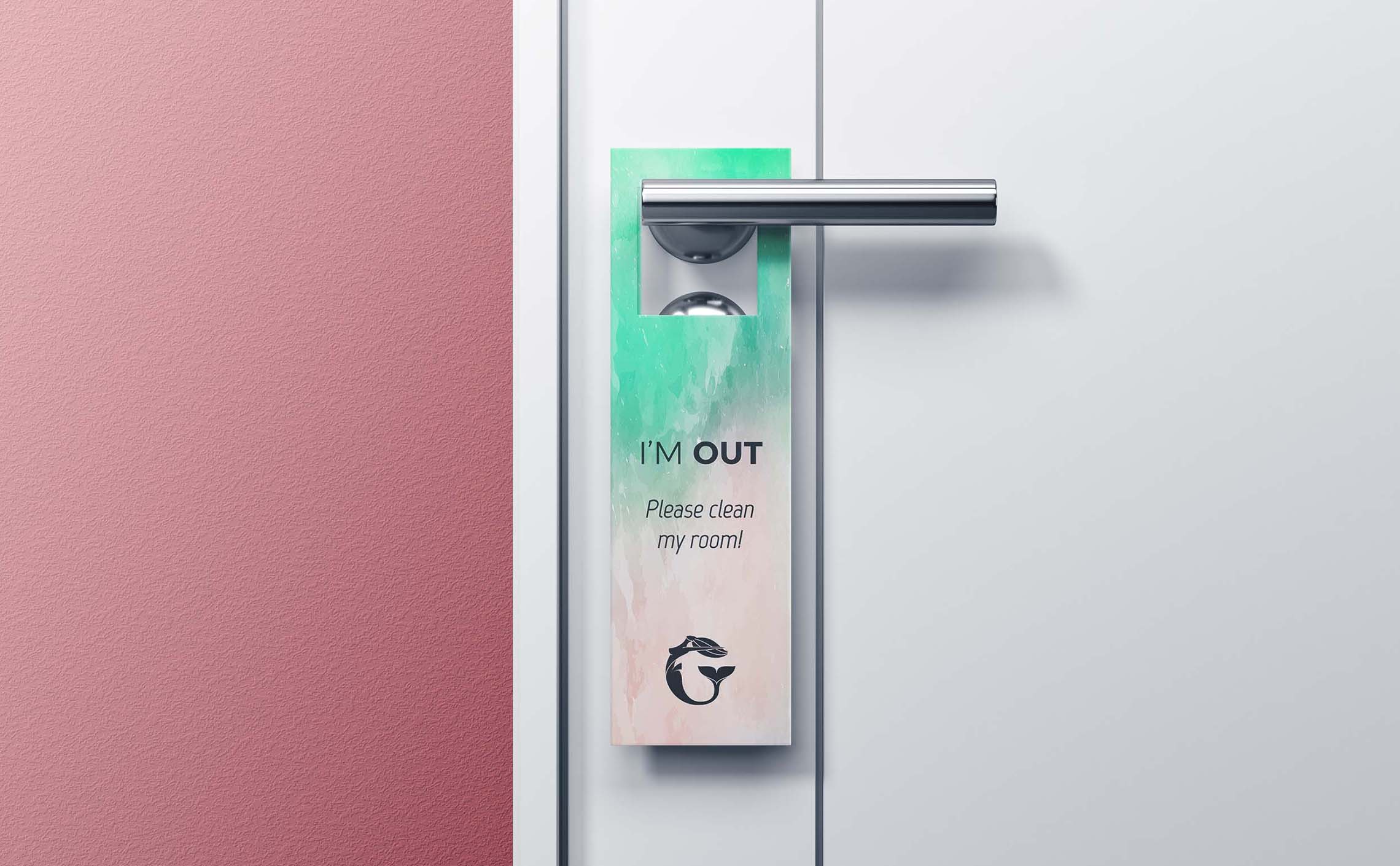
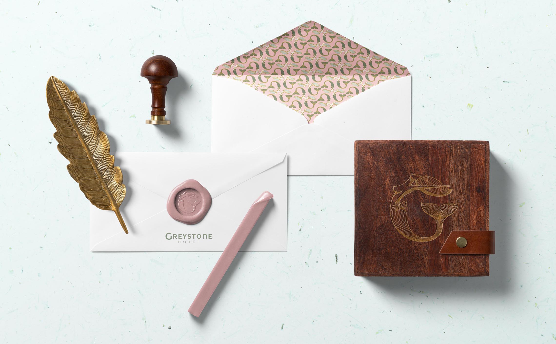
Applications
In situ applications of the branding on various mediums and situations.

Unused Alternatives
During the creation process, I of course explored alternative options. These stayed at an early stage of development and are by no means refined.
Miami Vice Vibe
Hand lettering in the dynamic and iconic style of 80's Miami. This concept was more oriented towards the youth and played on the neon-wave revival en vogue nowadays.
The loose and minimal calligraphy is also a bridge between Miami and Boho Chic, evoking the human touch, and the monoline style is reminiscent of the monoline fonts of the Art Deco era.
Art Deco Streamline Symmetry
This option played with the symmetry that can be achieved between the intial G and the last E.
The style is inspired by the Art Deco Streamline era, the same as the building, and also by the verticality of the neon sign on the facade. The curves remind of the hotel rounded architecture.
The idea here, was to evoke a restrained aesthetic, elegant and sobre, with the dimension of a hub of activities, illustrated by the arch shape, as a welcome sign.
Related projects:
Golden Gator
Sérêvène
Kobo
Uisce